Greyfriars Church
Greyfriars Church of Reading approached me with a desire to create a brand identity that visually represents their community more accurately than their current identity.
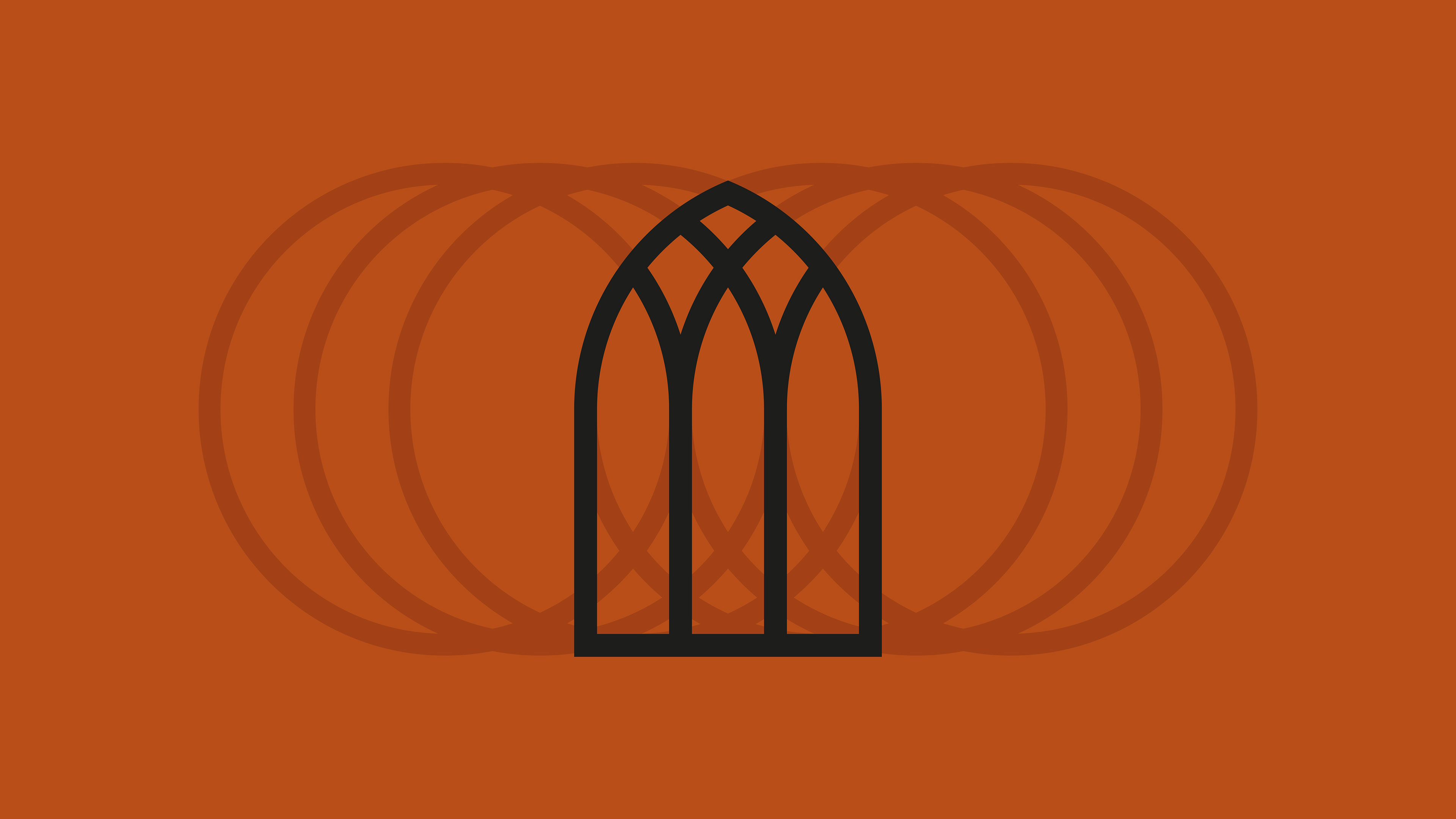
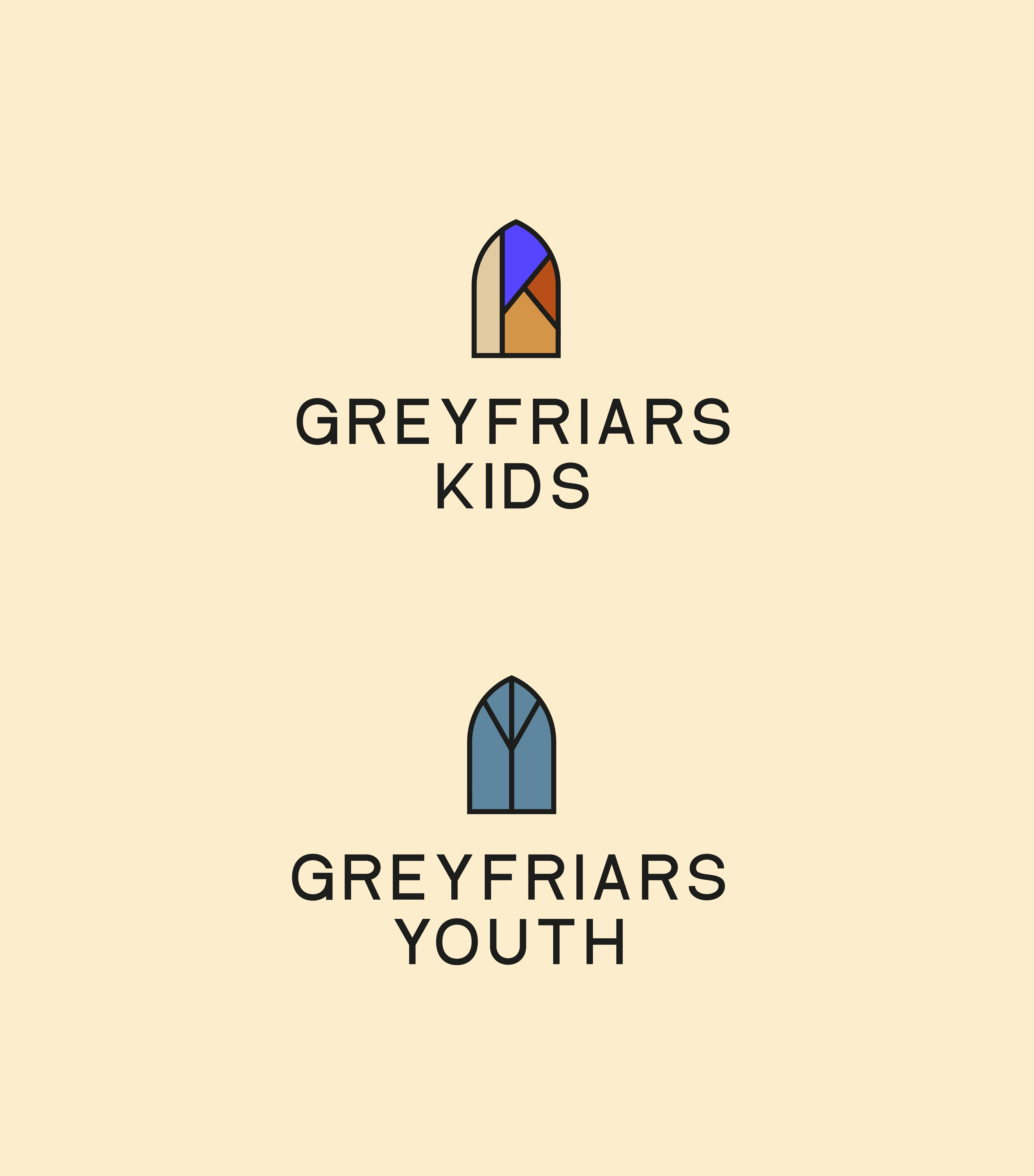
The logo is based on the iconic windows from the church building, then I developed a fun identity system from the deconstructed logo shapes. The outcome is playful and vibrant, appealing to a wider age demographic that better suits their community, giving the church a new lease of life.
The logo is based on the iconic windows from the church building, then I developed a fun identity system from the deconstructed logo shapes. The outcome is playful and vibrant, appealing to a wider age demographic that better suits their community, giving the church a new lease of life.
Logo
Visual Identity
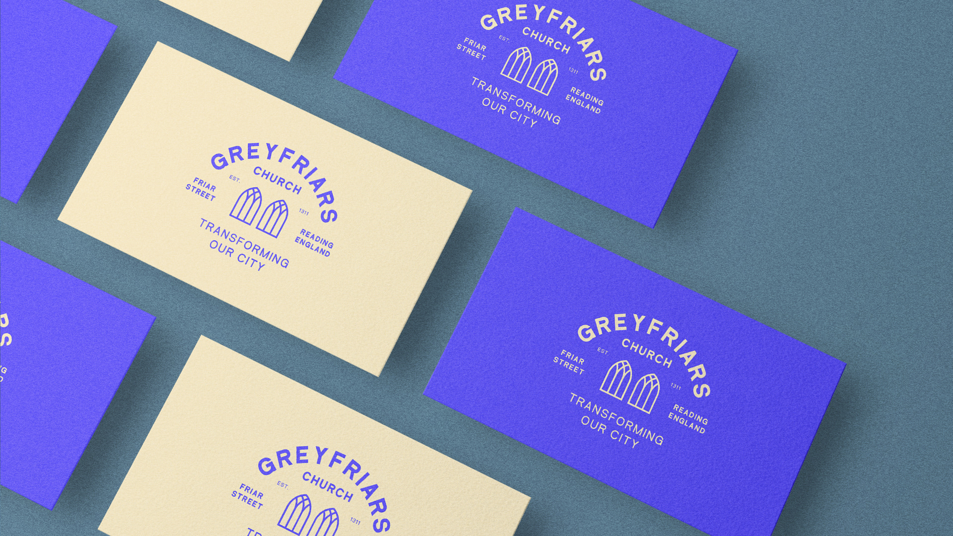
Brand Guidelines
Visual Identity
Brand Guidelines